Overview
Slider elements are horizontal tracks that adjust a value when slid. Play’s slider uses Apple’s native slider.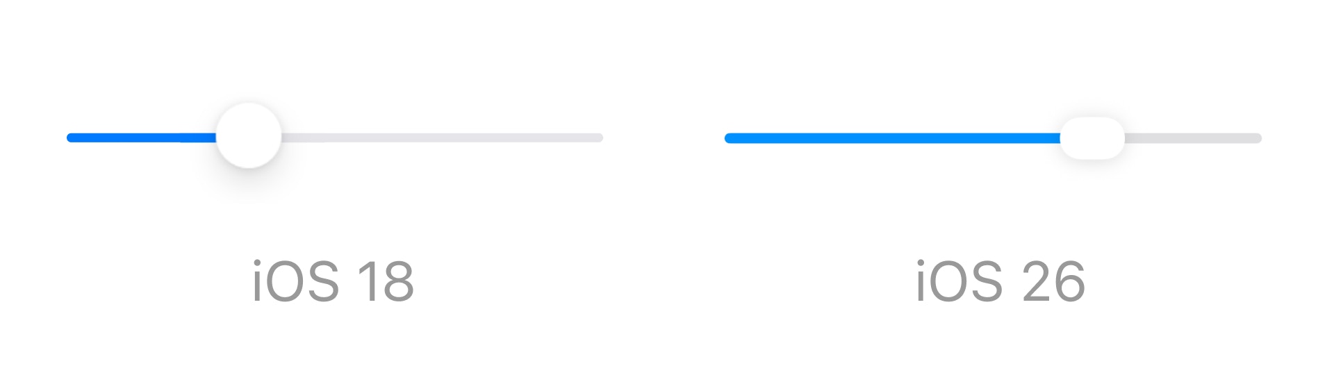
Properties
In addition to the properties below, glass effect containers also have access to general object properties in the Expression Editor.
Value
Set the slider’s starting value.In Expression Editor
In Expression Editor
numberCan get or set the value.
Step
Set the slider’s increment between each value.In Expression Editor
In Expression Editor
numberCan get or set the value.
Min
Set the bottom of the slider’s range.In Expression Editor
In Expression Editor
numberCan get or set the value.
colorCan get or set the color or an individual color property.
Max
Set the top of the slider’s range.In Expression Editor
In Expression Editor
numberCan get or set the value.
colorCan get or set the color or an individual color property.
Min Symbol
Set the SF Symbol to appear on the left of the slider.Max Symbol
Set the SF Symbol to appear on the right of the slider.Round To
Set the number of decimal places to display the slider values:- Whole Number
- 1 Decimal Place
- 2 Decimal Places
Neutral Value
Set the anchor point for the slider’s fill. For a default slider, this anchor point is the left-most side, making the natural value 0.In Expression Editor
In Expression Editor
numberCan get or set the value.
Ticks
Choose to display ticks for every step, custom steps, or no steps:- None: No ticks are displayed.
- Every Step: Ticks are displayed for every value in the slider’s range.
- Custom: Ticks are displayed at specific values within the slider’s range, indicated by comma separated values in the Tick Values property.
Snap to Ticks
Choose if a slider’s value must snap to each tick.Customize
Colors
Set the colors for the slider’s min, max, and knob.In Expression Editor
In Expression Editor
colorCan get or set the color or an individual color property.