Overview
SF Symbols are a set of 5000+ icons from Apple that are preloaded into Play. Each SF Symbol has a name and a category that you can search and filter by. You can add native animations to any icon with SF Symbol effects. We’ll use the words SF Symbol and icon interchangeably here.In macOS, you can add an SF Symbol to your page, canvas, or selection using the B key.
Properties
In addition to the properties below, glass effect containers also have access to general object properties in the Expression Editor.
SF Symbol
Select the SF Symbol.In Expression Editor
In Expression Editor
stringCan get or set the icon name.
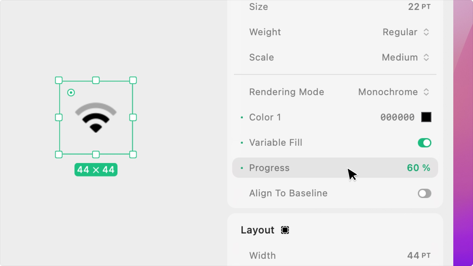
Size
Set the size of the SF Symbol, in points. This is different than the size of the SF Symbol element container, which is the hit area for interactions and can be adjusted with the Layout Panel’s Height & Width properties.In Expression Editor
In Expression Editor
numberCan get or set the point size.
Weight
Set the thickness of the SF Symbol to ultralight, thin, light, regular, medium, semibold, bold, heavy, or black.In Expression Editor
In Expression Editor
numberCan get or set the value.
Scale
Set the scale of the SF Symbol to small, medium, or large.In Expression Editor
In Expression Editor
stringValues:
small, medium, largeCan get or set the value.
Rendering Mode.
Set the appearance of the SF Symbol by varying the colors/opacities of the icon’s layers:- Monochrome: The default rendering mode in which every layer is the same color and opacity.
- Hierarchical: The icon’s layers vary in opacity based on importance, giving the icon depth.
- Palette: The icon’s layers vary in color, using one to three selected colors.
- Multicolor: The icon’s layers have predefined colors (i.e. the notification dot is always red). Only available for some SF Symbols.
Color(s).
Select the color (or colors) of the SF Symbol.In Expression Editor
In Expression Editor
colorCan get or set the tint color or an individual color property.
Tint Adjustment Mode.
Set how UIKit adjusts the tint color in situations where the app window is not in focus, like when presenting an alert):- Automatic
- Normal: Uses the tint color even when an alert is presented.
- Dimmed: Uses a dimmed version of the tint color (controlled by UIKit).
Variable Fill.
Choose to apply full opacity color partially based on a percent. Only available for some SF Symbols.