Overview
Activity indicator elements are spinning animations, communicating to users that something is loading. Activity indicators let users know that the app hasn’t stalled. Play’s activity indicator uses Apple’s native progress bar.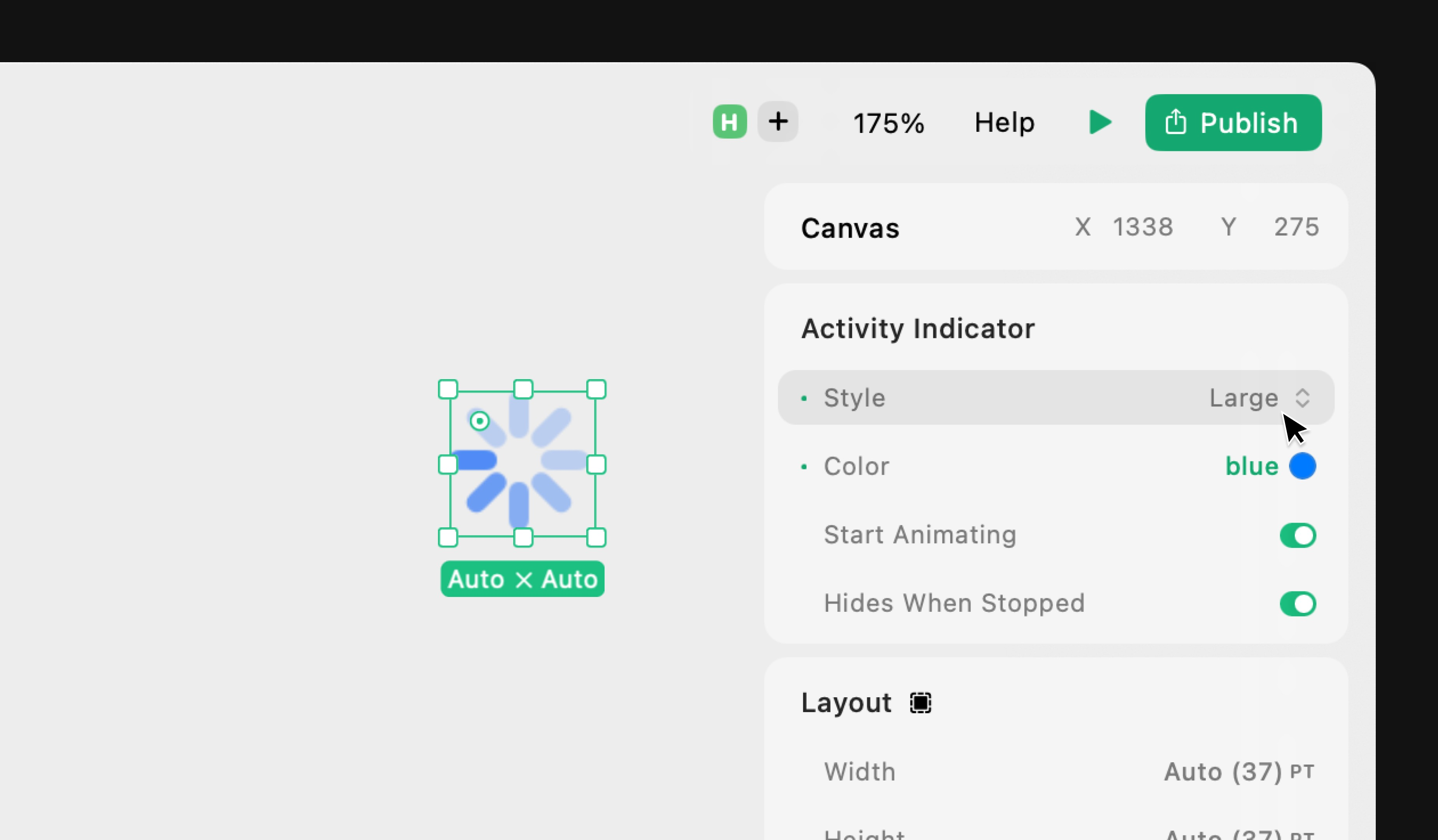
Properties
Style
Select the style of the indicator:- Medium: A medium sized indicator (~20pt).
- Large: A large sized indicator (~37pt).
In Expression Editor
In Expression Editor
stringValues:
"medium" , "large"Can get or set the value.
Color
Select the color of the indicator.In Expression Editor
In Expression Editor
colorCan get or set the tint color or an individual color property.
Start Animating
Choose if the indicator should start spinning by default.In Expression Editor
In Expression Editor
boolean Values:
true = enabledfalse = disabledCan get or set the value.
Hides When Stopped
Choose if the indicator should hide when it stops spinning.In Expression Editor
In Expression Editor
boolean Values:
true = enabledfalse = disabledCan get or set the value.