Overview
From titles to paragraphs, captions and more, text elements are a key part of most UI. Play lets you customize your text while staying within the bounds of technical feasibility. You’re able to edit text in the Element Settings Panel.Properties
In addition to the properties below, glass effect containers also have access to general object properties in the Expression Editor.
Text
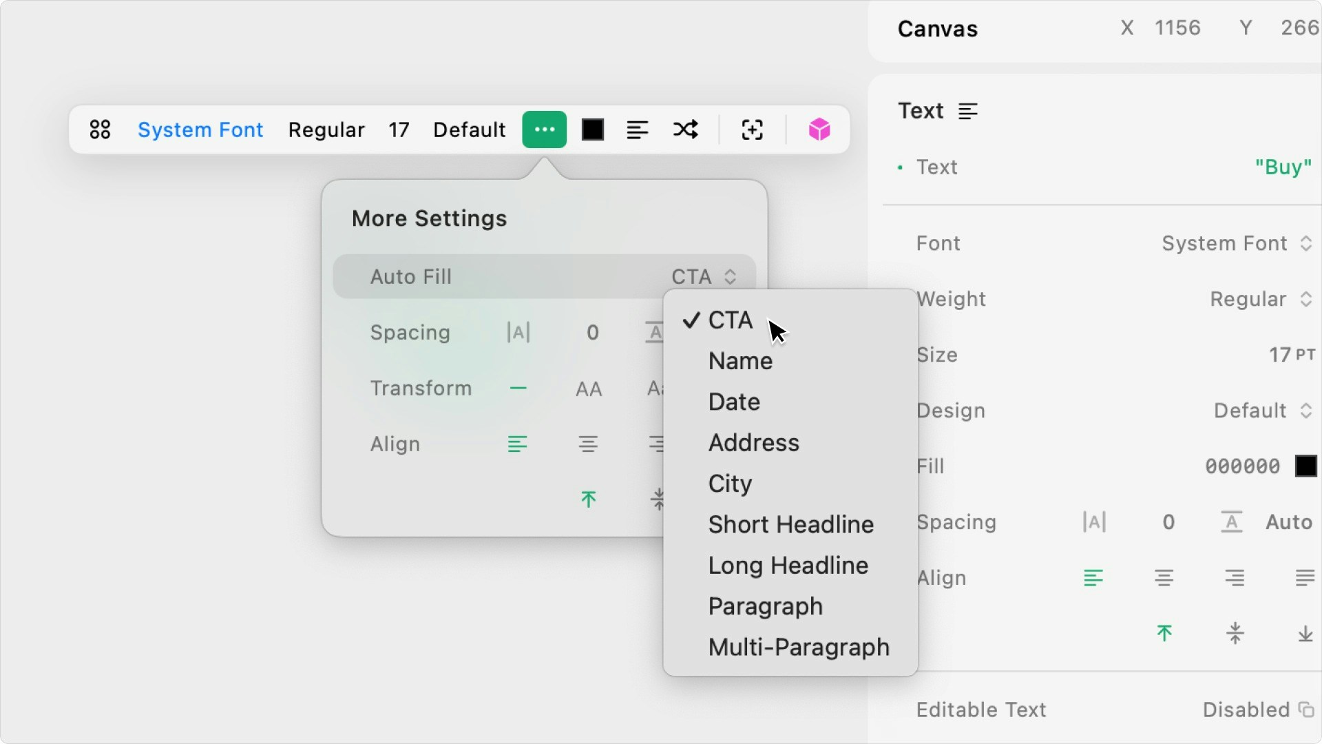
Enter the text copy. Play also provides auto-fill copy for CTA, Name, Date, Address, City, Short Headline, Long Headline, Paragraph, and Multi-Paragraph from the Context Bar settings.In Expression Editor
In Expression Editor
stringCan get or set the value.
Font / Style
Select the font family for the text. Instead of selecting a font family, you can also select one of Apple’s System Styles or a custom Type style from the project by clicking on the four-circle icon.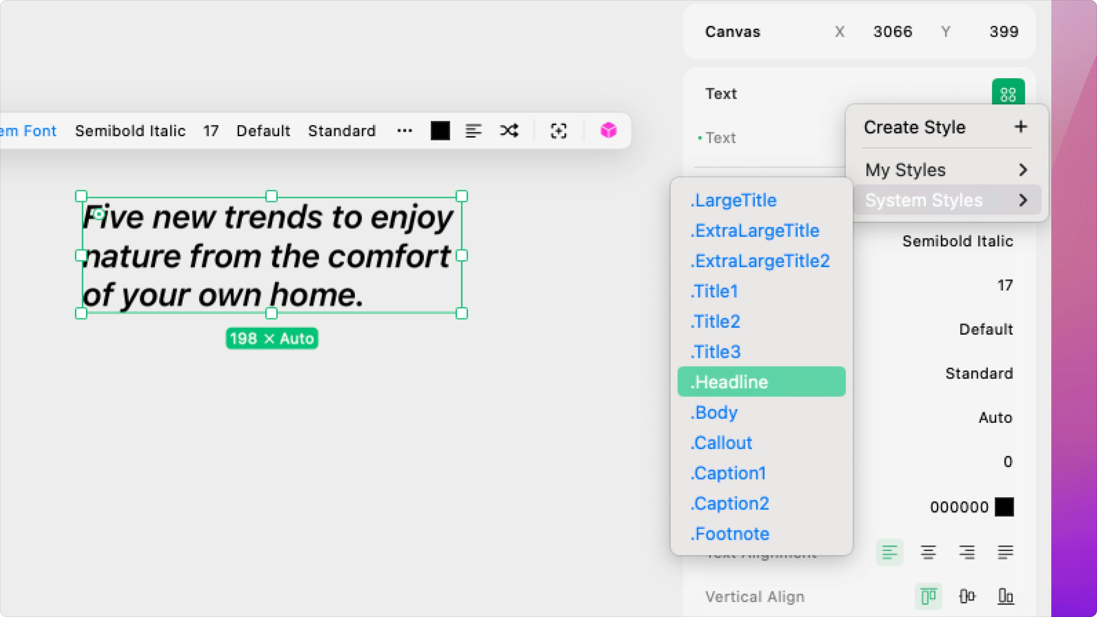
Weight
Set the weight from the options available for the selected font.Size
Set the font size. (not available for Custom or System Styles)In Expression Editor
In Expression Editor
numberCan get or set the value.
Design
Set the font’s design to default, monospaced, rounded, serif, compressed, condensed, or expanded (only available for System Font and System Styles):- Compressed: A rounded version of the default style.
- Monospaced: A monospaced, code-like version of the default style.
- Serif: A version of the default style with serifs.
- Compressed: A significantly more narrow version of the default style.
- Condensed: A slightly more narrow version of the default style.
- Expanded: A slightly wider version of the default style.
Fill
Select the color of the text.In Expression Editor
In Expression Editor
colorCan get or set the fill color or an individual color property.
Spacing
Set the letter spacing and line height, as a point value or a percent.In Expression Editor
In Expression Editor
numberValue:
>0Can get or set the value.
numberValue:
>0Can get or set the value.
Align
Set the horizontal (left, center, right, or justified) and vertical (top, center, bottom) alignment.More
Click the right side of the More property to open the submenu with the following options.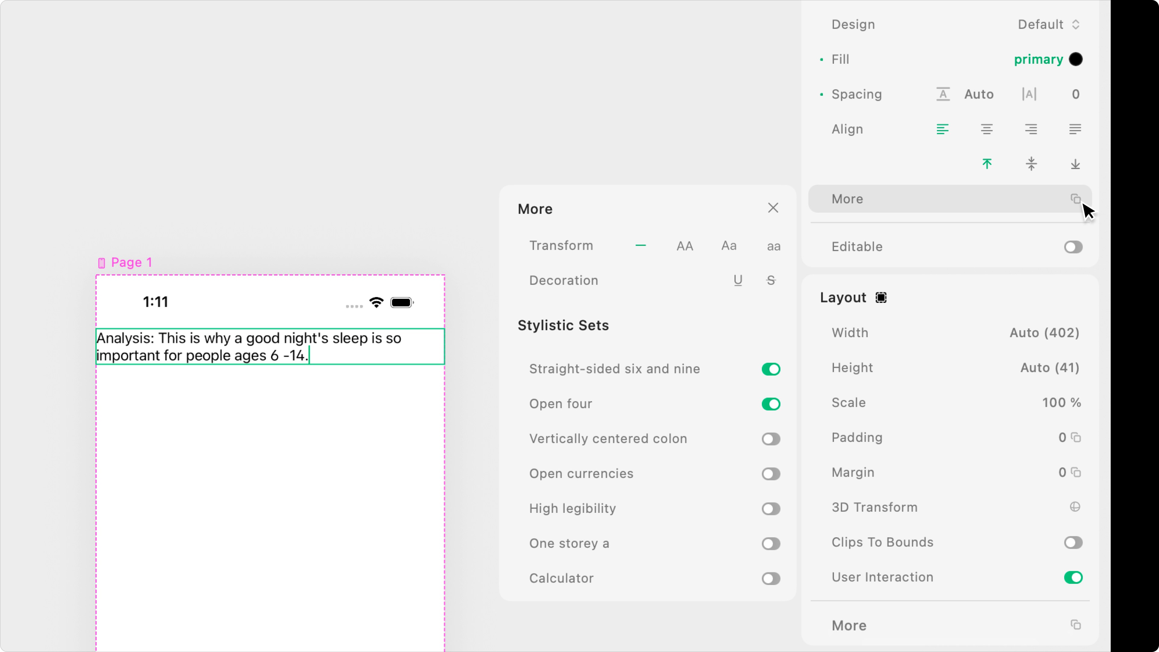
Transform
Set if the text should be all uppercase, lowercase, title case, or as typed.Decoration
Choose to underline or strike through the text.Stylistic Sets
Toggle to customize certain SF Font characters:- Straight-sided six and nine: Removes the curved edge of 6s and 9s for a more geometric appearance.
- Open four: Uses an open-top “4” shape for improved readability.
- Vertically centered colon: Aligns the colon’s dots vertically to improve balance and clarity.
- Open currencies: Uses currency symbols with open shapes for better legibility at small sizes.
- High legibility: Enhances character shapes for maximum clarity, especially in dense or small text.
- Single-story a: Replaces the double-story “a” with a simpler, single-story form.
- Calculator: Uses monospaced, simplified numeral forms optimized for calculator-style readability.
Editable Text
Toggle “Editable” on to open the submenu with the following options.Is Editable
Choose if the text can be edited when tapped by the user. Any copy the user enters will be saved as the text element for the Play session.In Expression Editor
In Expression Editor
boolean Values:
true = editablefalse = not editableCan get or set the value.
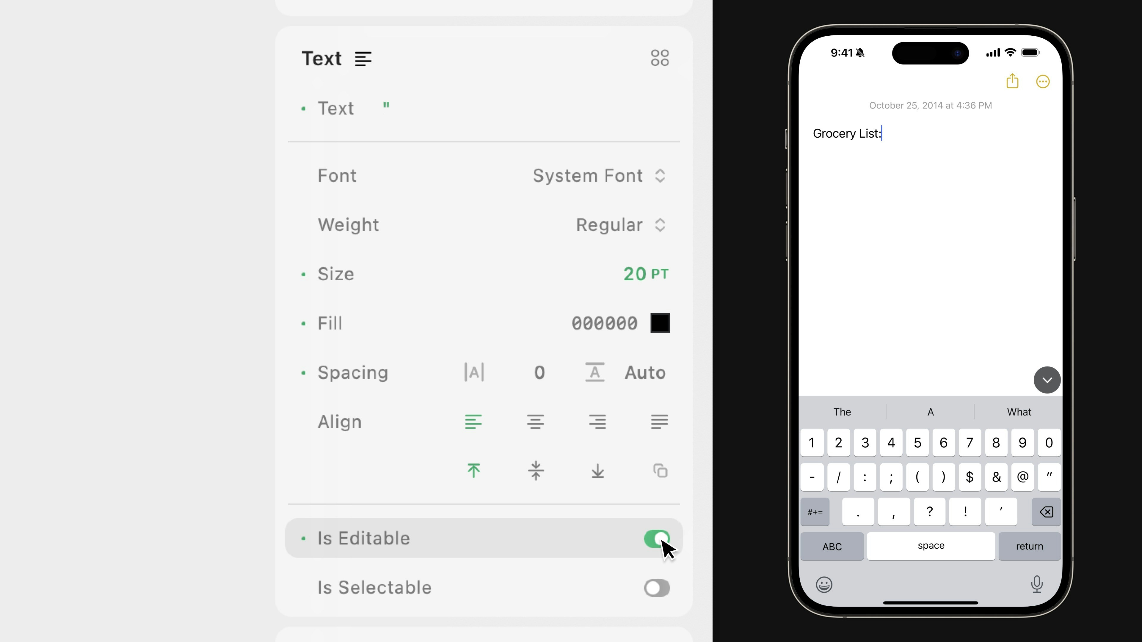
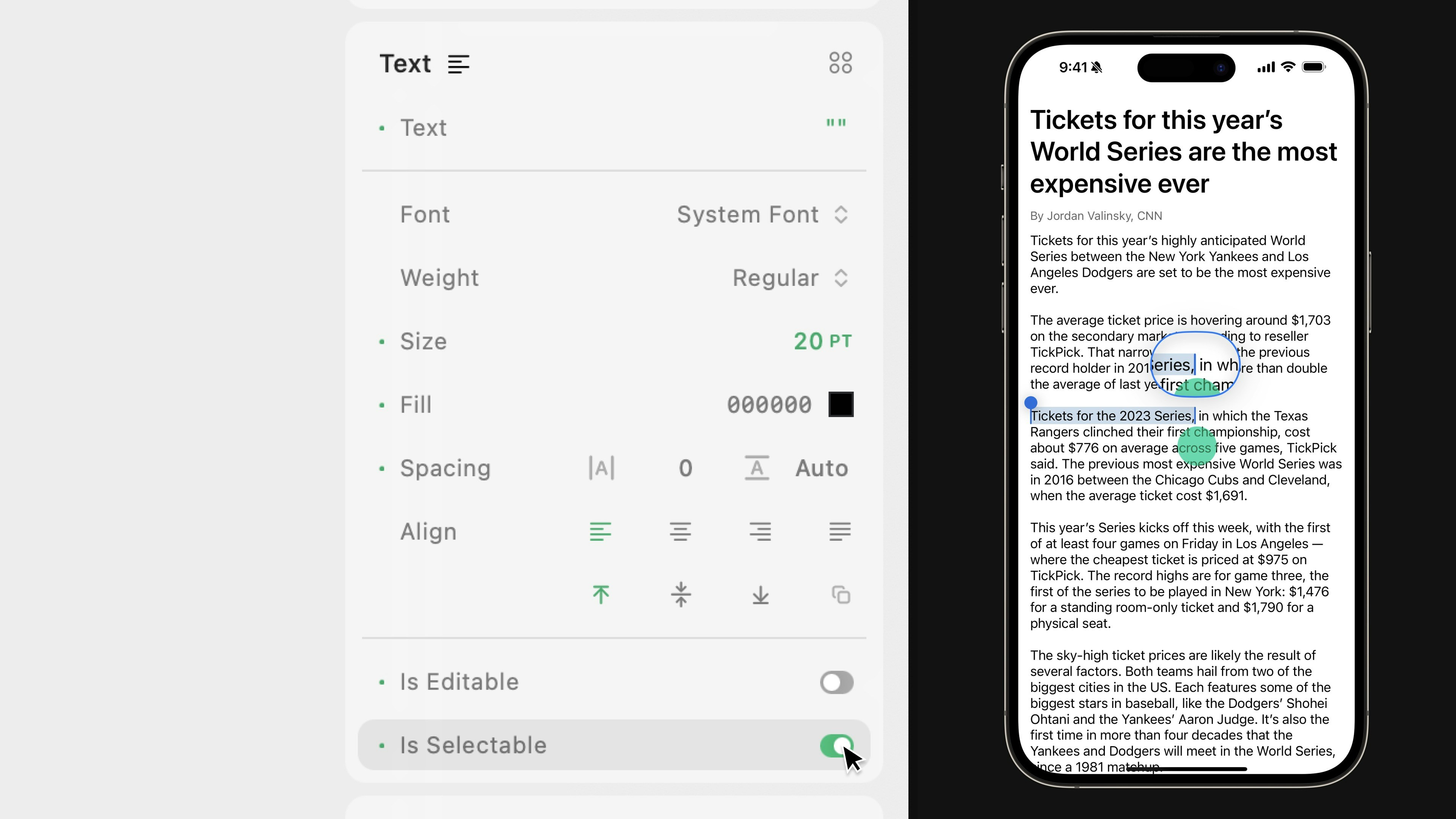
Is Selectable
Choose if the text can be selected when a user double-taps it. The native edit menu will appear, allowing users to drag the selector and use the native options that appear, like Copy, Look Up, Translate, and more. All that functionality is built in and completely native.In Expression Editor
In Expression Editor
boolean Values:
true = selectablefalse = not selectableCan get or set the value.
Keyboard
Set the keyboard’s type to default, email, number pad, numbers and punctuation, phone pad, or decimal pad.In Expression Editor
In Expression Editor
stringValues:
Default, Email, Number Pad, Numbers and Punctuation, Phone Pad, Decimal PadCan get or set the value.
Return Key
Set the return key’s CTA to Go, Google, Join, Next, Route, Search, Send, Done, or Continue.Dismiss Keyboard on Return Key
Choose if the keyboard should close when the user hits the return key.Auto-Capitalization
Choose if the text field will automatically capitalize characters:- None: No characters will automatically be capitalized
- All Characters: Capitalizes all characters
- Sentences: Capitalizes the first character in sentences
- Words: Capitalizes the first character in words
In Expression Editor
In Expression Editor
stringValues:
None, All Characters, Sentences, CharactersCan get or set the value.
Auto-Correction
Choose if the text field will use auto-correction.Text Content Type
Set the text field’s expected input type so the system has information. Set the type to None, URL, City, State, City And State, Country, Credit Card Number, Date, Time or Duration, Email Address, Flight Number, Shipment Tracking Number, Full Street Address, Name, Name Prefix, Name Suffix, Given Name, Family Name, Job Title, Postal Code, Sublocality, Username, Password, New Password, or One Time CodeIn Expression Editor
In Expression Editor
stringValues:
None, URL, City, State, City And State, Country, Credit Card Number, Date, Time or Duration, Email Address, Flight Number, Shipment Tracking Number, Full Street Address, Name, Name Prefix, Name Suffix, Given Name, Family Name, Job Title, Postal Code, Sublocality, Username, Password, New Password, One Time CodeCan get or set the value.