Overview
Buttons are one of the most common UI elements in products, used to initiate actions with a tap. Play has four button presets: Large, Medium, Medium + Icon, and Icon. These all use the button element, but they’re customized into common UI patterns for different starting points. You can adjust the properties for all of them.To use a native button or design a custom button?You can create a “button” using a stack with text and/or an SF Symbol, but native buttons provide a couple of unique benefits:
- Native buttons are a single layer. The text, icon, and spacing are prebuilt and fully customizable. Native buttons keep your project clean!
- Native buttons use Apple’s UIButton’s SwiftUI properties. It’s easy for engineers to plug in values as they code.
Properties
In addition to the properties below, images also have access to general object properties in the Expression Editor.
- Button
- SwiftUI Button
Tint
Select the button’s primary color. Color overrides are available in the Customize popup.In Expression Editor
In Expression Editor
Copy
Ask AI
Button.tintColor
colorCan get or set the tint color or an individual color property.
Size
Set the button’s size to small, medium, or large. The size can be overridden by the Layout Panel’s Width & Height properties.Style
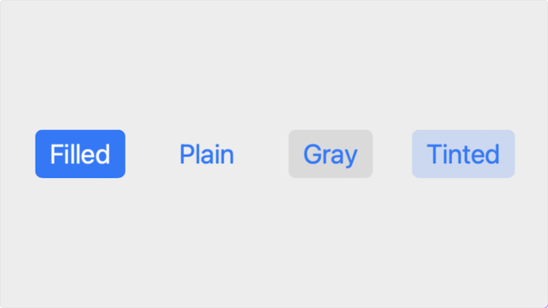
Set the button’s style:- Filled: The text is white and the background is the tint color.
- Plain: The text is the tint color and there is no background color.
- Gray: The text is the tint color and the background is a low-opacity gray.
- Tinted: The text is the tint color and the background is the tint color at a low opacity.
- Glass: The text is the tint color and the background uses the system’s default glass material.
- Clear Glass: The text is the tint color and the background uses a clearer, higher-transparency glass material.
- Prominent Glass: The text is the white or high-contrast and the background uses a stronger, more opaque glass material.
-
Prominent Clear Glass: The text is white or the tint color and the background uses a high-clarity but brighter glass material.

Corner Style
Set the button’s corner radius:- Dynamic: The corner radius changes based on the button’s size.
- Small: The corner radius is 4pt.
- Medium: The corner radius is 6pt.
- Large: The corner radius is 8pt.
- Capsule: The corners are completely curved.
- Custom: The corner radius can be set to any point value with the Button Corners property. Click the right side of the Button Corner property to set individual corners.
Content
Set the content within the native button. A native button is a single layer, but it includes a combination of title text, subtitle text, and icon.
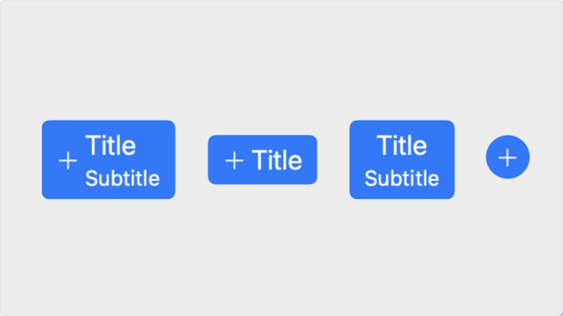
Title
Enter the button’s title (label). OptionalIn Expression Editor
In Expression Editor
Copy
Ask AI
Button.title
stringCan get or set the value.
SF Symbol
Select the button’s SF Symbol, and customize its size & weight. OptionalIn Expression Editor
In Expression Editor
Copy
Ask AI
Button.symbolName
stringCan get or set the value.
Copy
Ask AI
Button.symbolScale
stringValue:
small, medium, largeCan get or set the value.
Copy
Ask AI
Button.symbolSize
numberCan get or set the value.
Copy
Ask AI
Button.symbolWeight
styleValues:
ultralight, thin, light, regular, medium, semibold, bold, heavy, blackCan get or set the value.
Subtitle
Enter the button’s subtitle. OptionalIn Expression Editor
In Expression Editor
Copy
Ask AI
Button.subtitle
stringCan get or set the value.
Alignment
Set the vertical and horizontal alignment of the button’s contents.Customize
Text Properties
Set the Title and Subtitle’s text properties. Learn more about text properties.In Expression Editor
In Expression Editor
Copy
Ask AI
Button.titleColor
colorCan get or set the tint color or an individual color property.
Copy
Ask AI
Button.subtitleColor
colorCan get or set the tint color or an individual color property.
Symbol Properties
Set the icon’s properties. Learn more about SF Symbol properties.In Expression Editor
In Expression Editor
Copy
Ask AI
Button.iconTintColor
colorCan get or set the tint color or an individual color property.
Copy
Ask AI
Button.iconSecondaryColor
colorCan get or set the tint color or an individual color property.
Copy
Ask AI
Button.iconTertiaryColor
colorCan get or set the tint color or an individual color property.
Control Padding
Set the button’s padding.BG
Set the button’s background color.Title
Enter the button’s title (label). OptionalIn Expression Editor
In Expression Editor
Copy
Ask AI
Button.title
stringCan get or set the value.
System Image
Select the button’s SF Symbol, and customize its size & weight. OptionalIn Expression Editor
In Expression Editor
Copy
Ask AI
Button.symbolName
stringCan get or set the value.
Copy
Ask AI
Button.symbolScale
stringValue:
small, medium, largeCan get or set the value.
Copy
Ask AI
Button.symbolSize
numberCan get or set the value.
Copy
Ask AI
Button.symbolWeight
styleValues:
ultralight, thin, light, regular, medium, semibold, bold, heavy, blackCan get or set the value.
Image Alignment
Set if the button’s image should be on the left (leading) or the right (trailing) of the title.Gap
Set the gap between the title and the image.Style
Set the button’s style:- Auto: Automatically selects the appropriate button style based on context and hierarchy.
- Borderless: The text is the tint color, and the button has no visible border or background.
- Bordered: The text is the tint color, and the button has a subtle outline using the tint color at low opacity.
- Bordered Prominent: The text is white, and the background is filled with the tint color.
- Plain: The text is the tint color and there is no background color.
- Glass (iOS 26 +): The text is the tint color, and the background uses the system’s default glass material.
- Glass Prominent (iOS 26 +): The text is white or high-contrast, and the background uses a more opaque glass material with adaptive tinting.
Border Shape
Set the button’s corner radius:- Auto: The corner shape automatically adapts to the button’s size and context.
- Circle: The button’s width and height are equal, and the shape forms a perfect circle.
- Capsule: The corners are completely curved.
- Custom: The corners are slightly curved.
Tint
Select the button’s primary color. Color overrides are available in the Customize popup.In Expression Editor
In Expression Editor
Copy
Ask AI
Button.tintColor
colorCan get or set the tint color or an individual color property.
Destructive
Choose if the button style should be destructive, which makes the button red and removes the “Tint” option.Customize
Text Properties
Set the Title and Subtitle’s text properties. Learn more about text properties.In Expression Editor
In Expression Editor
Copy
Ask AI
Button.titleColor
colorCan get or set the tint color or an individual color property.
Symbol Properties
Set the icon’s properties. Learn more about SF Symbol properties.In Expression Editor
In Expression Editor
Copy
Ask AI
Button.iconTintColor
colorCan get or set the tint color or an individual color property.
Copy
Ask AI
Button.iconSecondaryColor
colorCan get or set the tint color or an individual color property.
Copy
Ask AI
Button.iconTertiaryColor
colorCan get or set the tint color or an individual color property.

