Overview
Segmented controls display a horizontal set of segments that each function like a distinct button. Play’s segmented control element lets you customize Apple’s native segmented control.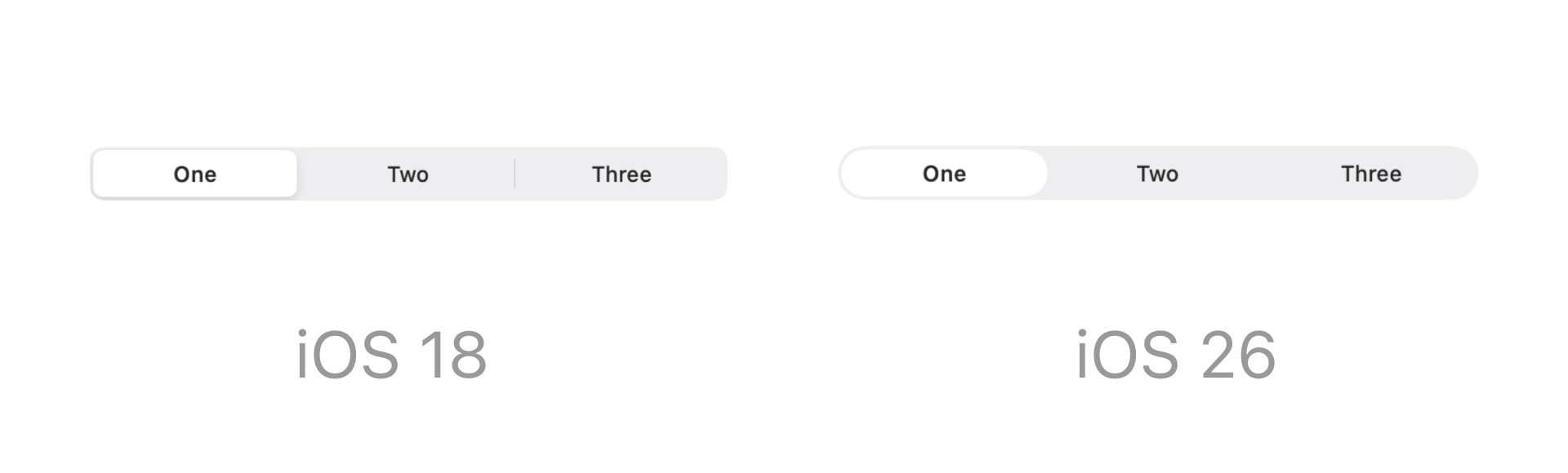
Properties
In addition to the properties below, glass effect containers also have access to general object properties in the Expression Editor.
Segments
Enter the values for each segment, separated by a comma. The number of values entered will be the number of segments.In Expression Editor
In Expression Editor
numberCan get the number of segments.
Value
Set the default selected segment.In Expression Editor
In Expression Editor
numberCan get or set the selected segment index.
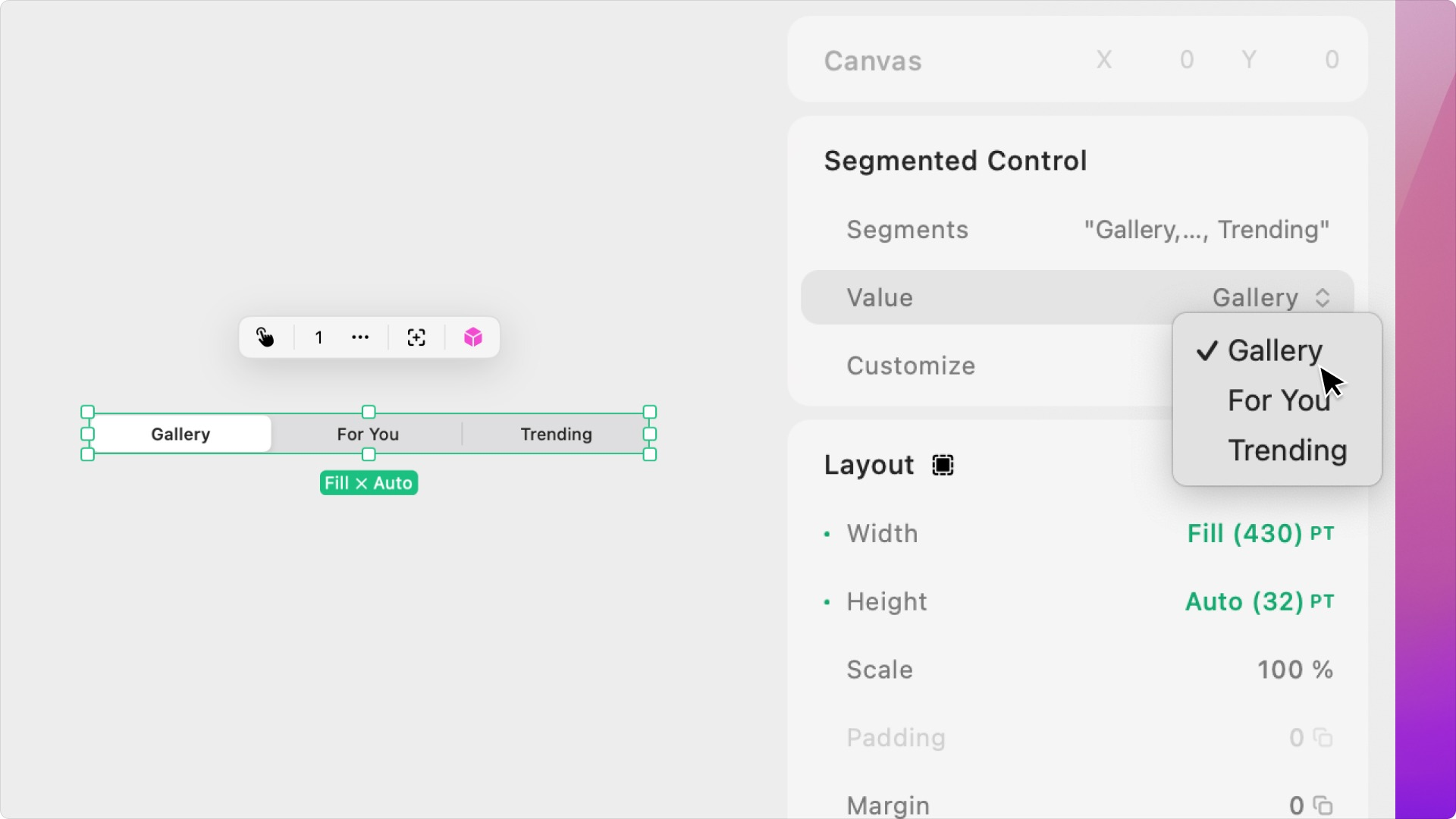
Customize
Colors
Set the colors for the segmented control’s unselected labels, selected label, unselected background, and selected background.Control Padding
Set the segmented control’s top and bottom padding.Label Style
Set the Style or Font, Weight, Design, Size, Letter Spacing, and Text Transformation for each of the Segment labels.Using the Segmented Control with a Horizontal Stack
- Add an H stack to your page and set the with to 100% and height to 100%. Add two objects with 100% width to your stack. Add a segmented control to your page, pin it to the top center, and offset it from the top by 48pt.
- With the segmented control selected, go to the Interactions tab. Add a Segment Selected Trigger, go to the trigger settings, and set the Segment to Segment 1.
- Add a Set Scroll Action. Set the Target as the H stack, the Type to Scroll To, the Direction to Horizontal, and the End State to 0%.
- Now, add another Segment Selected Trigger, go to the trigger settings, and set the Segment to Segment 2.
- Add a Set Scroll Action. Set the Target as the H stack, the Type to Scroll To, the Direction to Horizontal, and the End State to 100%.