Overview
On each page in a Play project, you’ll see an infinite canvas surrounding a device-sized screen. This is your page preview. You can set this preview to any iOS size, iPadOS size, or custom size, with or without a bezel, allowing you to test your prototype’s responsiveness across different devices.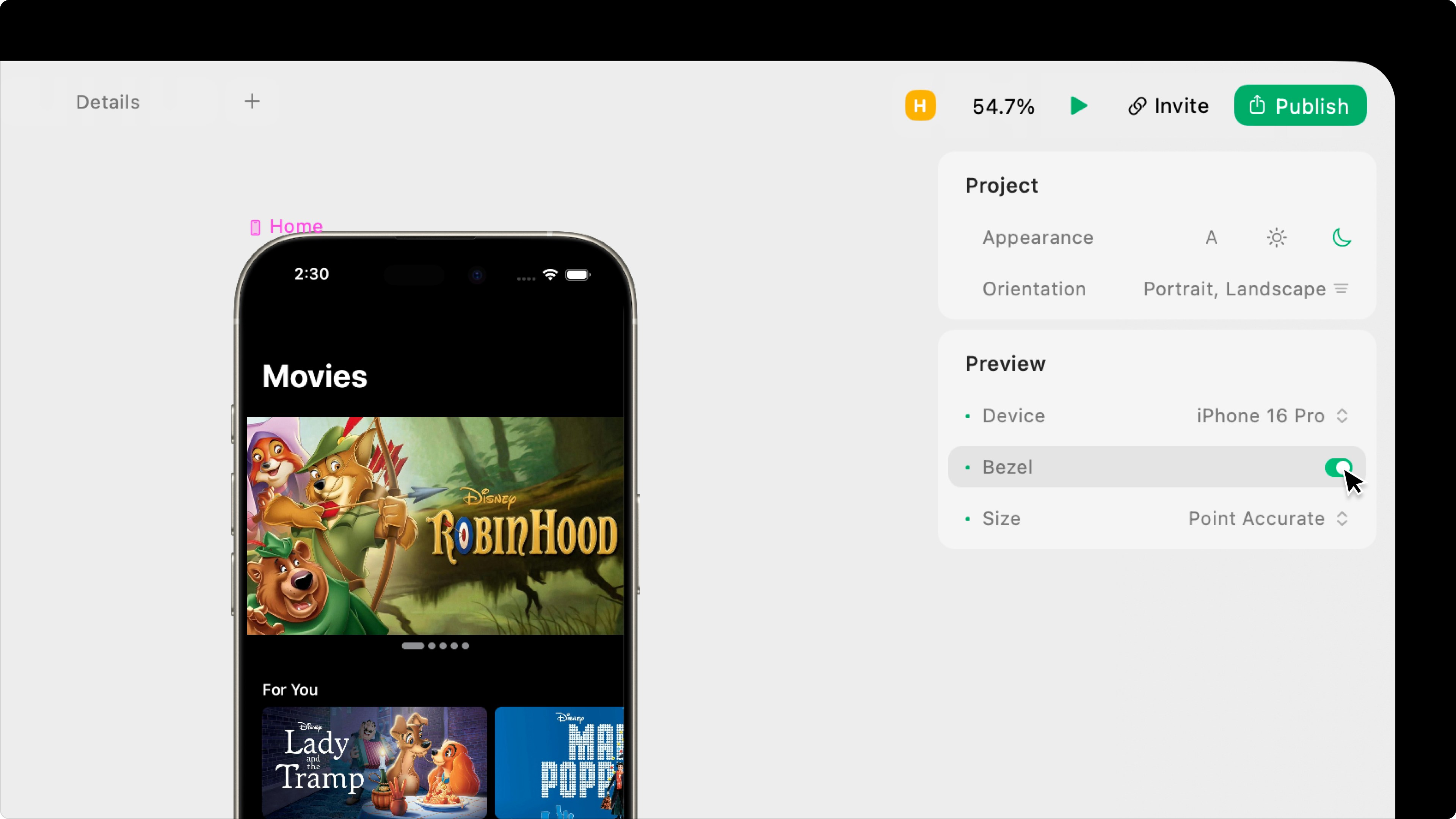
Device
Select the project’s preview size.iOS Devices
iOS Devices
We try to add the newest iPhone models within a month of their official release.
- iPhone 17 Pro Max
- iPhone 17 Pro
- i Phone Air
- iPhone 17
- iPhone 16 Pro Max
- iPhone 16 Pro
- iPhone 16 Plus
- iPhone 16
- iPhone 16e
- iPhone 15 Pro Max
- iPhone 15 Pro
- iPhone 15 Plus
- iPhone 15
- iPhone 14 Pro Max
- iPhone 14 Pro
- iPhone 14 Plus
- iPhone 14
- iPhone 13 Pro Max
- iPhone 13 Pro
- iPhone 13 mini
- iPhone 12 Pro Max
- iPhone 12 Pro
- iPhone 12 mini
- iPhone SE (2nd generation)
- iPhone 11 Pro Max
- iPhone 11 Pro
- iPhone 11
- iPhone XR
- iPhone XS Max
- iPhone XS
- iPhone X
- iPhone 8 Plus
- iPhone 8
iPadOS Devices
iPadOS Devices
We try to add the newest iPad models within a month of their official release.
- iPad mini (A17 Pro)
- iPad Pro 11-inch
- iPad Pro 12.9-inch (6th Gen)
- iPad Pro 13-inch
Custom Device Sizes
Custom Device Sizes
You can change the width and height of any custom device size at any time. These are just presets.
- Custom
- Custom (1200 x 800)
- Custom 1400x 1024)
- Custom (1600 x 1280)
You can change the device at any time, but the currently selected device will be the same across all pages in a project.
Bezel
Choose whether to display the selected device’s bezel, pulled from Apple.Bezels are not available for custom sized devices.